Control panels
It's a while ago, but I worked on the redesign of the control panels structure in Windows Vista. The goal was to make settings easier to find by creating categories. We added search and browsing capabilities. Navigation based UI was innovative in those days! We cleaned Windows of tons of dialogs within dialogs, with rows of tabs. It made hidden settings easier to discover and find.


Windows Update
While being part of the MSX Design team I led a small group of other UX Designers. Together we were responsible for all control panels. While my team worked on parts like Windows Networking and Windows Parental Controls, I was personally responsible for the improvement of Windows Update, Windows Security Center, and Windows Firewall.
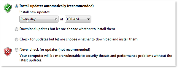
Updates at shutdown
It's my only patent (so far). But something I am proud of.
Sometimes the best user experience is one where users don't notice the experience at all. Nowadays we take it for granted that software updates don't interrupt you with sudden reboots while you are happily working. But that is how it was at the time I worked on Windows Vista. Installing updates at shutdown is also a feature that was once invented. It was a great UX improvement. We received a patent for it, of which I am proud - and this marble cube is a pleasant reminder ;-)
It required users to opt-in to automatic updates. So we added that to the first-time-user experience (see image below).

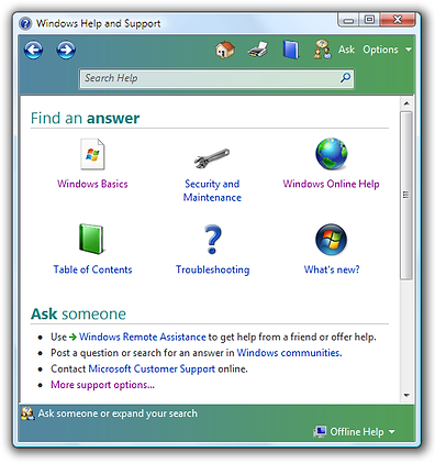
Help & Support
I was the main designer of the Help & Support experience. In previous Windows versions help content always appeared on top, hiding the interface that users needed help with. The new version had a window that opened on the side of the main window, so you could read help text without obstructing the interface.
Other design improvements were:
-
direct links to the interface - so we didn't need help to tell you where to click anymore
-
help itself got a browse & search interface
-
no dead-ends: offering online help communities