ONLINE FORMS
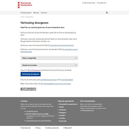
The people of Amsterdam come to the public services department to get things done: Change their address, get a parking permit, or ask for financial support. To do this online, they need complete online forms. This should be simple and smooth, but that wasn't the case when the UX Lab started. How can we improve these funnels and increase success rates?
From offline to online
The goal was to move people from offline to to online. That meant: not calling help-desk, and not going to a physical location. But the online forms were functioning badly. Before redesigning, we dove into all available research: We analyzed surveys, Usabilla, web statistics, internal CRM-tool data, call logs, conducted usability studies, and spent hours to analyze and reframe content, legislation, and requirements.

Fixing funnels
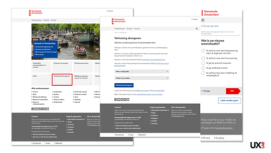
We learned that users were dropping out of the funnel left and right, so we set on the path of fixing them. Part of improving the funnels was:
-
improving Google search results for every task
-
clear landing and start pages
-
re-ordering steps
-
better timing of information
-
moving decision trees to the start of a form ( so it users didn't find out after many steps that this form actually wasn't meant for them )
-
better interaction models
-
better hierarchy and layout of elements
-
making forms mobile friendly
-
removing text, but keeping effective help instructions.
For the Change Address form we increased the success rate from 47% to 58% which meant we helped to realize a tremendous cost saving.